Role
UX Consultant for the revamp of the Secacam app.
Conducted workshops to introduce Design Thinking methodologies in the team.
Managed to establish a user-first approach to their design decisions.
Outcome
Slimming down the number of screens to less than 50% of the initial thoughts.
Standardizing reusable components.
Avoiding shipping an app with looks from the 90’s.
Applying the 5 Why’s to get the team beyond habitual thinking.
Team
Ingo Noppel – Product Owner
Tino Richter – Front End
Renee Klimkeit – Back End
Carlo Pols – Consultant
Ron Beurskens – Innovation Manager
Werner Kloetsch – Business Owner
INTRO
Overview
Secacam was born as a spin-off of the Twister Media Group, the company I worked for. This side project became bigger over the years and many conservationists, hunters and garden-owners acquired one or more Secacam’s.
They are thriving in the German market! Due to the strong competition, they needed to ship an app. The main goal was to allow the users to get a notification when the camera triggers a picture and show that in the app. Although the app fulfils that mission, they are growing fast and users expect more out of it.
They had the means and budget to achieve more, and that is when the Innovation Team in Amsterdam came into play. They had all the hardware knowledge and the user feedback, we instead, brought the know-how to deal with a digital product.

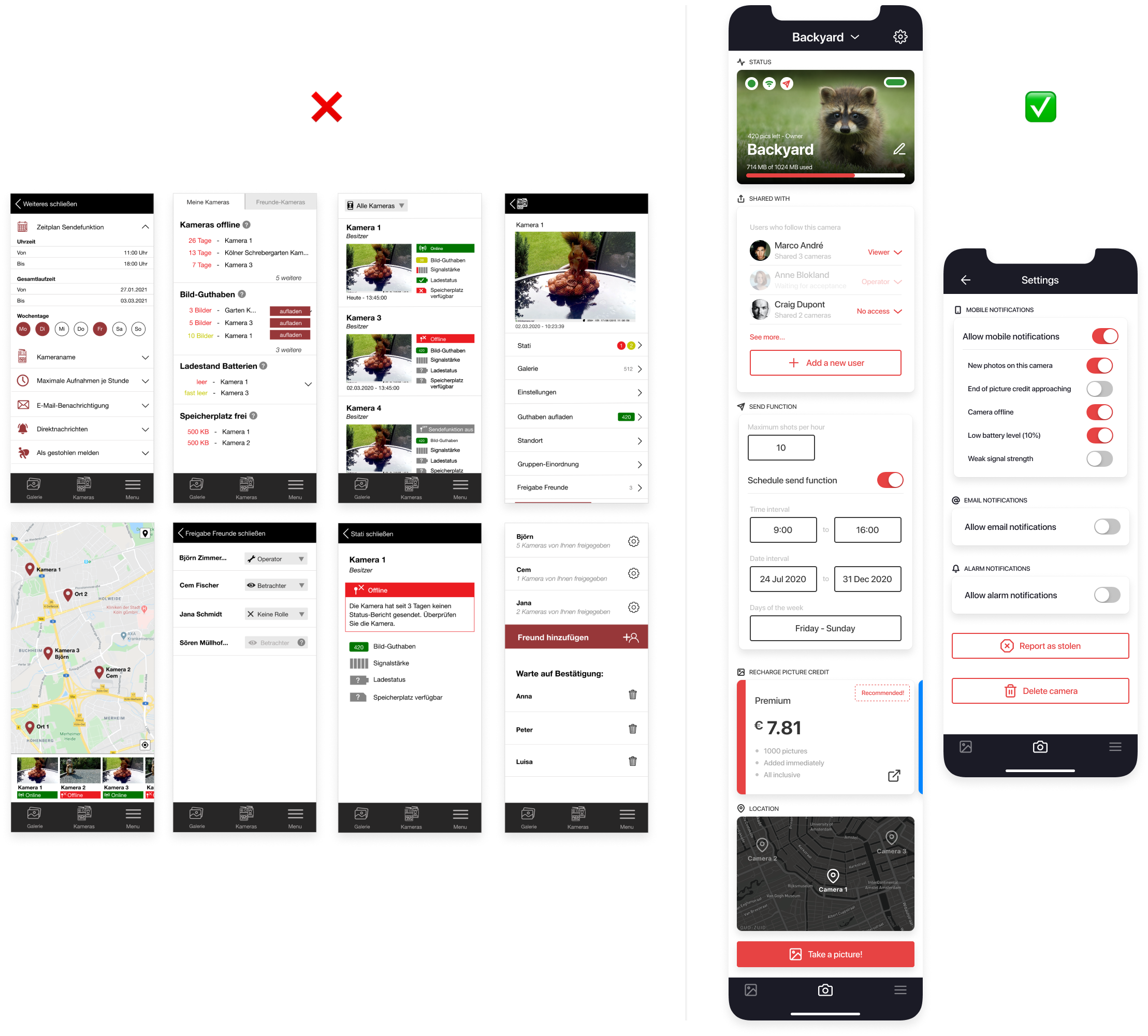
‘Vintage looks’ of the app 1.0 while I was exploring the camera settings and the app itself. Lots of work ahead!
GOALS
Bridge the gap
Create an app that will add value to the users, aligning with the core team. As an external team, we needed to be seen as an opportunity instead of as a threat.
Manage stakeholders with valuable data and meaningful designs. There is a strong hierarchy in the company with a top-down approach towards design decisions.
- Prioritize, ditch or re-think features by talking to the users. There are a lot of assumptions within the team. Better to start small, smart and iterate depending on how users interact.
HOLD YOUR HORSES
Design Thinking
While getting to know the product and the team, we saw that their ideas were piling up on top of each other. The foreseeable outcome was meant to be a complex app with a dramatic user experience. That led us to take a step back in the project and start from scratch by conducting a workshop.
The main goal of the UX Creative Workshop was:
- Get a better perception on their users and their needs.
- Know how to translate data into valuable designs.
- Manage stakeholders within the organization.
- Create a design system for a better and faster way of working.
- How to translate the designs in an actual product.
They truly appreciated the workshop as it added value to their newly-established critical thinking mindset.
GOING WIDE
Ideation
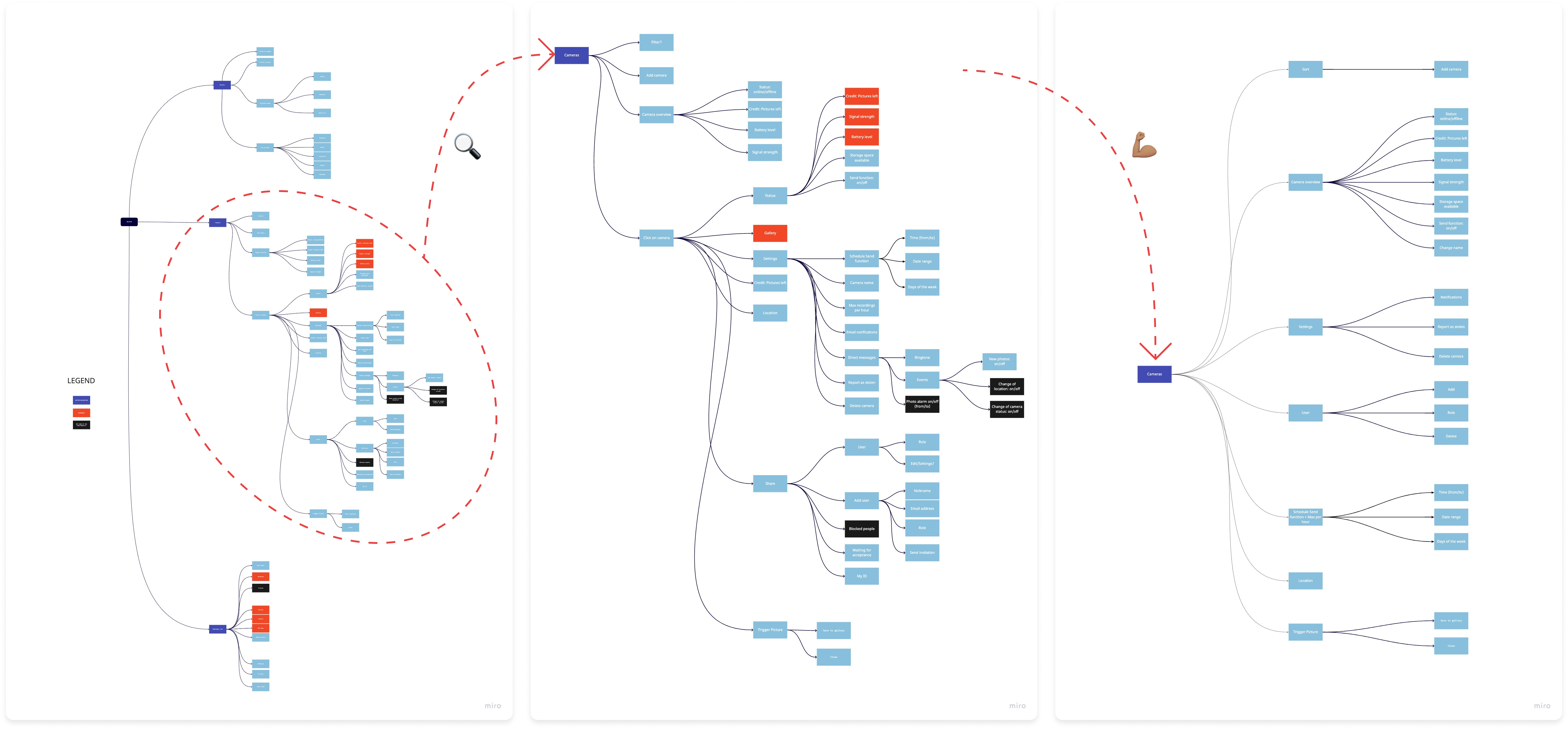
To get something more tangible, I decided to create a Sitemap of their initial approach. The result was overwhelming. It was intended to be an intuitive app. I worked on it a few days before the workshop, and brought a completely different approach as breeding ground to increase their engagement… and to have fun!

Left: Sitemap or their work in progress. Center: zoom-in to the camera bottom navigation. Right: substantial improvement and simplification of the navigation
One of the features they ditched was to create a whole community within the app. It did not relate to any persona or user story. What the users actually needed was to share their camera with others – for security reasons or just to show off. Sharing cameras was part of the community feature and we wanted to see their approach.
We printed out all the screens and let them guide us through this journey. QR code was the main way to pair users to cameras. It was a dead-end since both users could scan but none could be scanned. First thoughts:
- Is QR code the best way to share your camera? You can only do that face to face and there is no need to restrict users from doing it differently.
- Are they communicating with the Back End? If they do it on a daily basis, this situation would have been tackled way earlier.

Tino during the Crazy 8’s ideation session. Screenshots of the “QR code gate” to share cameras with others
SOLUTION
How I did. Business impact
Our contribution to them has been enormous. I noticed the team was in love with their product, their baby. So we had to manage the expectations carefully. We needed to bring our experience and know-how without them feeling threatened. The approach was to acknowledge what could happen following different scenarios. Examples:
- Drastically slimming down the number of screens. Not for the sake of it, but for an intuitive app for the users. Cost-efficient: when finding the developer partner, they will charge you according to the number of screens.
- Components library. Time-consuming? Yes. Better in the long-term? Hell, YES. For the team, and to make developers’ life easier, avoiding back and forth discussions.
- UI patterns. By showcasing good practices in the industry they saw they did not need to reinvent the wheel. I created a clickable prototype with their proposals and encourage them to do some user testing. The answer was there.

Left: camera features digging up to a 5th level of navigation, making it hard for the user. Right: my proposal to have everything handy and intuitive for the user
TAKE AWAYS
What I've learnt
I have been fortunate enough to help take a product from scratch to a ready-to-ship prototype. However, it was a bumpy ride, and I have come away with lessons that are widely applicable.
- Core operations influence product design decisions: a camera, its hardware, and firmware are things to take into account while designing. The core team is on top of it and gladly introduced me the different constraints.
- Manage stakeholders is key for a product to succeed or fail. Or at least, to have a huge impact in the product and the money spent on it.
- Being an external has its ups and downs as you might not be fully in control. Embrace it, do your best and row together.
- Involve the whole team earlier. We saw there was a huge lack of communication between the Front End and the Back End.
I really hope they will become the Go-Pro of the wildlife cameras in the near future!
