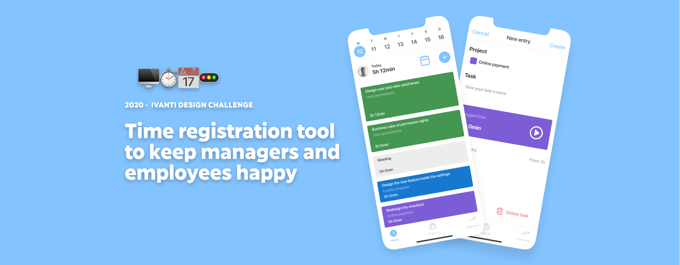
Role
Applied for a UX Designer role at Ivanti in The Netherlands.
The expected deliverables were:
- My thinking process: how, and why did you make your decisions.
- My design process: which techniques did you use to design the final result.
- The app should have its own identity.
Challenge
At 3M, the current time registration tool allows staff to register their time. It does its job but the UX is terrible.
Due to the bad experience with the tool, staff barely register their hours in a timely or correct manner without repeated reminders by their manager.
As a result, staff gets irritated and the R&D manager spends a lot of time checking data and chasing people up to do a chore they hate doing.
INTRO
Goal
Design a time registration tool that allows staff to register the necessary hours efficiently and without annoyance.
This way, employees (both, staff and manager) would save time performing the task, which translates into more mental health. The company would have happier and more efficient employees, which means spending less money. #assumption01
Despite being provided with some valuable information, I will make plenty of assumptions along the way.
This time registration tool is part of a greater purpose. For this challenge, I will just consider the time registration. Ideally, the tool would time-track every task the user is performing and the tools they are using. The boundaries and rights would be arranged by mutual agreement. #assumption02
RESEARCH
User groups
- Staff 1: performing a small number of tasks a day, in a fairly focused manner. They usually spend a couple of hours on a task, then move on to another task.
- Staff 2: works more reactively and in smaller time chunks. They start out on a task, get triggered to pick up something else, then return to the original task, then go to a meeting, then get triggered to do another task, then return to the first task, etc.
- Manager: spends a lot of time checking data and chasing people up to do a chore they hate doing.
RESEARCH
Competitors
Mandatory step to check some strengths and weaknesses in the industry. I analyzed three app from competitors that have good reviews on the App Store: Hubstaff (4.8), Clockify (4.1), and Timely (4.5).
Main strengths:
- Intuitive and straight to the point Play/Stop button for tasks – Clockify and Hubstaff
- Clear bottom navigation – Timely
- Integrations with the entire work toolkit – All
- The hybrid between timer or manual entry and its overruling function – Timely
Main weaknesses:
- Having an empty app without onboarding or dummy tasks – Clockify and Hubstaff
- You cannot resume a task once you have Played/Stopped it – Clockify
- Hamburger icon menu that makes me lose track of the context – Clockify and Hubstaff
- The hybrid between timer or manual entry might be incongruent – Timely

RESEARCH
User interviews
“I do not want to feel micromanaged”“We estimate tasks as a team. To fine-tune them, we have the retrospective meeting to improve together as a team”“I trust my team and I hope they will come to me if they are running into problems” – Manager
RESEARCH
User Journey Map
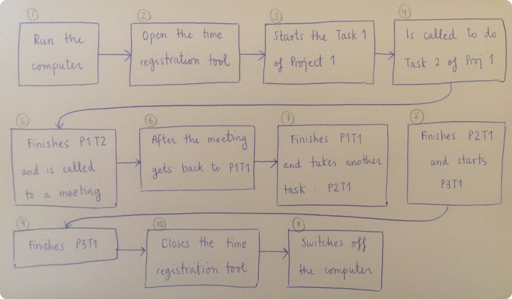
Time to put myself in the user’s shoes. I will explore the happy path (#assumption03) of a user within the Staff 2 group. Why? Because it is the most challenging one: they barely register their time and it is something they hate doing. And they have to do it a lot.
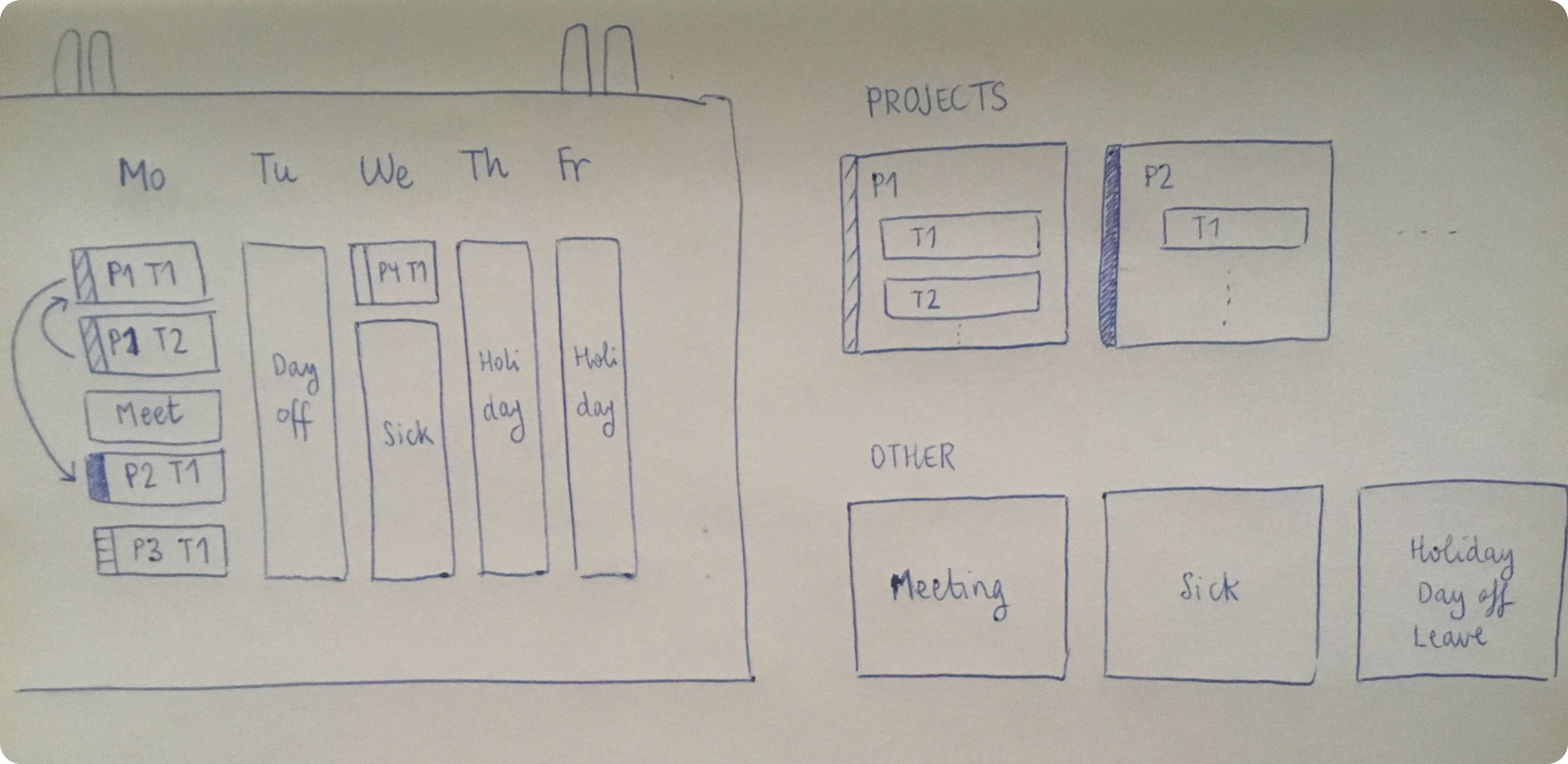
Below, I simplified how a regular Monday can be. As well, I illustrate how tasks are children of a project. The only separate entities are the absent hours, that they will not belong to a project #assumption04.
EMPHASIZE
Problem Statement
After digesting all that information, it is good to recap and emphasize with our users once more. What do they really want?
As an employee, I expect to register my tasks quick and effortlessly, so that I do not feel it is part of my daily routine.
As a manager, I expect to see my team progress without flaws, so I can plan projects and delegate accordingly.
SKETCHING & WIREFRAMING
Ideation
The challenge is not a blank canvas. There are some requirements the user should list:
- hours spent per project
- hours spent on various work activities
- hours absent due to illness / holiday / leave
The hours can entered at any time, but must be finalized for their manager to review by the end of the week.
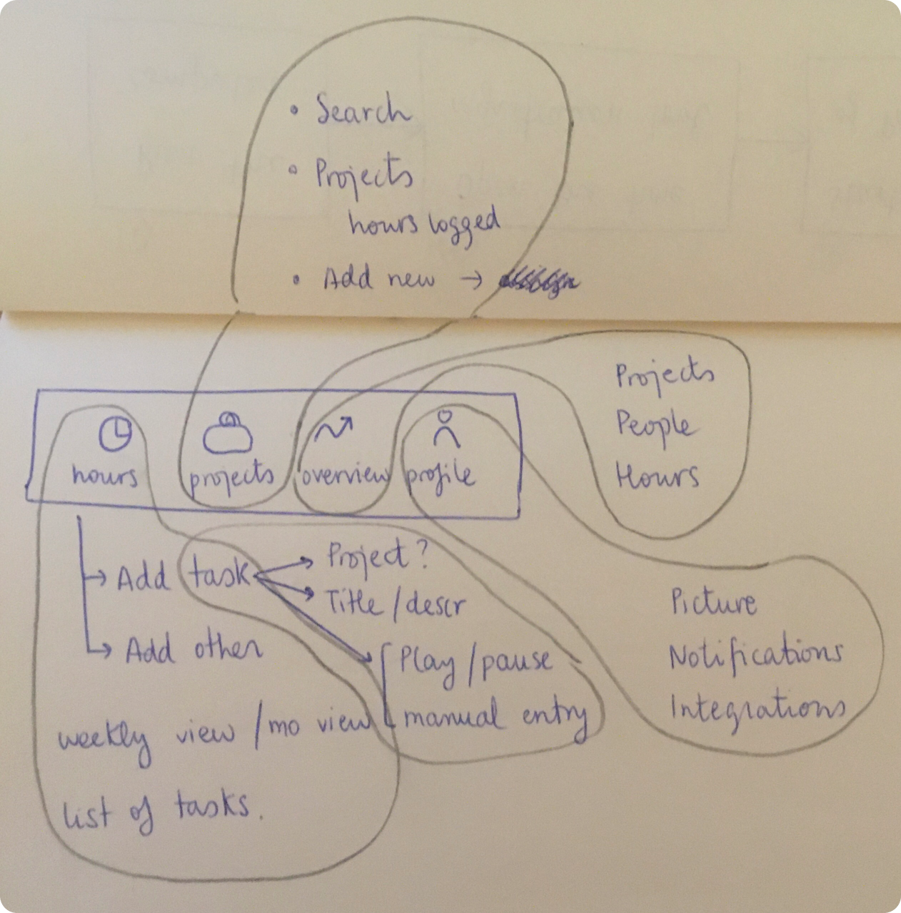
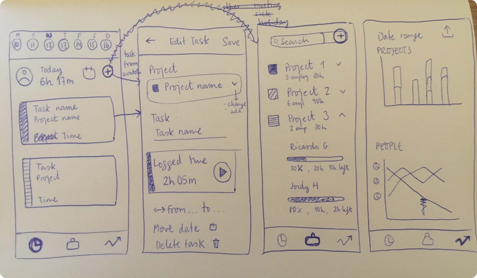
As I found the bottom bar more appealing than a hamburger icon to navigate the app (#assumption05), I decided to accommodate all the needed features in the different tabs.
Hours will be the most used tab (#assumption06) where the user will constantly register their time. It will be the landing screen.
Projects will allow the user to have an overview of the cumulative tasks’ time on each project.
Overview is a tab mostly used by the manager #assumption07.
Profile: a tab where user can manage their notifications and 3rd party integrations.
Thanks to the integration with PM tools like Jira, Monday… The tasks are already set up. That way we are making users’ life way easier #assumption08.
The profile tab is not something to use on a weekly basis, so I merged its functionalities on the main screen #assumption09.
If we use the Play button on a task, it automatically stops any other task that was running in the background. We are humans and can only do one thing at the same time #assumption10.
HIGH-FI
Results
For the final design, I gave more importance to the mobile app to the detriment of the desktop one. This way users can go to meetings without bringing the laptop and still updating their progress #assumption11.
Since one of the deliverables is the app having its own identity, I chose the blue palette because it inspires truth and confidence #assumption12.
Do you want to have a look at the final prototype? Click here!

TIME'S UP!
Next steps
Iteration: since these tasks are going to accompany our users for the rest of their professional life, I would like to try it with people in real life to see where I can save a couple of clicks.
I have not taken into account the scenario of a task overlapping two days. That’s worth considering despite choosing the happy path.
For the absent hours like holidays, it would be ideal to duplicate those time slots and apply them over a time range. As well, those hours will be stored in a database, reason why the “Other” section for projects must be better thought of.
The app can also be handled on desktop. Great addition, especially for managers to check all the stats and performance.
Include the hourly rate of each employee so the manager would have a great overview of the cost of each project.
